Suggested User Experience Improvements for DiffMerge
Frankly, I'm kind of a ninja-Buddha-wizard at the UX.
Perhaps you are familiar with my ground breaking work with "Console.ForegroundColor = ConsoleColor.Red" and other visual sensations.
As such I am uniquely qualified to provide suggestions for achieving incremental benefit to the User Interface of tools in the marketplace.
One of my favourite little free tools is 'DiffMerge' from Source Gear.
This is a file-difference tool that I consider to be a step or two better than the other free diffing tools on the market.
Here's the toolbar from DiffMerge. Look at the last three icons:
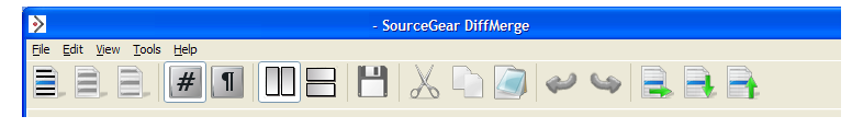
There's a "foolish consistency" here: all three have the same green arrow, pointing in different directions.
But the nature of those three buttons is not consistent. Up and down are purely navigational elements, while the 'left to right' arrow is for pushing changes from one document to the other.
In buddhist terminology we say that their Qi is mis-chimed.
As such, I think that the colour of that arrow could be changed to provide a little warning of the power of this button.
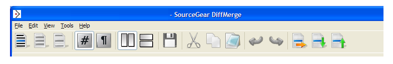
To really take this up a notch, I'd go even further. That's right. You thought the first change was pretty extreme.
I'd put a separator in there, to give the left-right arrow a little space of its own. This is the UI principle of 'Proximity' - I don't have time to explain it to you kids right now, but UX-buddha's like me, we get funky with proximity all the sweet time.
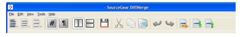
Further more (and this is where I really trip out on the UX-pixie-dust) I'd do something tricky with the 'Save' icon.
If and when the file on the right is 'changed,' I would like to see a little red/orange highlight given to the save icon, to give some more "visual weight" to this element. (Currently it goes from slightly grey, to black... it's perhaps a little too subtle)
There you have it.
With a few light touches we've transformed the application. From something everyday and - dare I say - drab, we've dragged it kicking and screaming into the wild and crazy future.
Welcome to the twenty third century, DiffMerge.
That's how we kick it: UX-Buddha-style.
'Alb' on Thu, 25 Mar 2010 09:53:44 GMT, sez: Were you reading codinghorror.com yesterday? :) Good suggestions but I'd even go a bit further. To fit with convention a bit more I'd move the general tools (save, cut, copy etc) over to the left.
And following on from your comment about the save colours, I think generally it's nice to have significant colour in any icon that can be disabled to differentiate between the monotone of the disabled image.
'lb' on Thu, 25 Mar 2010 10:36:11 GMT, sez: @Alb
re:
>Were you reading codinghorror.com yesterday?
That darn Jatwood went and published his article in-between when I wrote a draft of this, and when I published it.
My trusty co-editor JoCo Loco, who had read the draft, said to me this morning "Oh man, you should see Coding Horror this morning. He's totally been sniffin through your drafts again."
Damn Jeff!! If only he didn't write so well. And his headings are so catchy.
The real cause it much simpler: we were both inspired by a tweet from Merlin Mann a couple of days ago.
"Kudos to Gmail's iPhone team. Placing "Send" 5px to the left of "Save" has made my profanity astoundingly more specific."
http://twitter.com/hotdogsladies/status/10894368536
To which Jeff replied:
"@hotdogsladies also a problem with "mark as spam". Blog-worthy IMO, I do that all the time, too."
8:50 AM Mar 23rd via web in reply to hotdogsladies
SO there's the histonomy of a "coincidence"
lb
'Michael' on Thu, 25 Mar 2010 15:16:33 GMT, sez: While the new save icon is an improvement, I am concerned.
When do we need to start worrying that folks won't understand that an icon of a floppy disk means "save the file" because they've never seen a floppy disk before, let alone used one?
'Scott' on Mon, 29 Mar 2010 20:31:01 GMT, sez: Back to the drawing board...
I'm color blind and can't tell the difference from the original icon to your suggested change.
'lb' on Mon, 29 Mar 2010 23:51:07 GMT, sez: @Scott
Yes it seems to fail for both forms of Red/Green color blindness.
http://vischeck.homeip.net/uploads/12699134796143/
http://vischeck.homeip.net/uploads/12699135166437/
But the good news is that it looks *extra* awesome if you have the very rare blue/yellow color blindness.
http://vischeck.homeip.net/uploads/12699136417069/
'chrome plating' on Wed, 31 Mar 2010 07:04:42 GMT, sez: the new save icon is looking more professional and good. i like it
'Dan' on Wed, 07 Apr 2010 13:45:17 GMT, sez: How about just a whole new icon set? ;-)
|