NimbleText 1.9 -- BoomTown!
I put out a new NimbleText a few days ago.
The release notes are here, but do you want the minutely-detailed and wildly self-indulgent story behind the release notes? Of course you do!
Along with a spattering of smaller improvements, the main innovation is that you can now expose your settings (and quickly change them) from the toolbar.
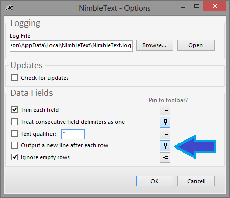
I wanted this for a while, but couldn't find the right way to let the user configure it. Finally, with inspiration from Windows 7, I came up with using a pin/unpin metaphor, inside the Options form, like so:
Coming up with this design was surprisingly difficult. Some of the designs I rejected were:
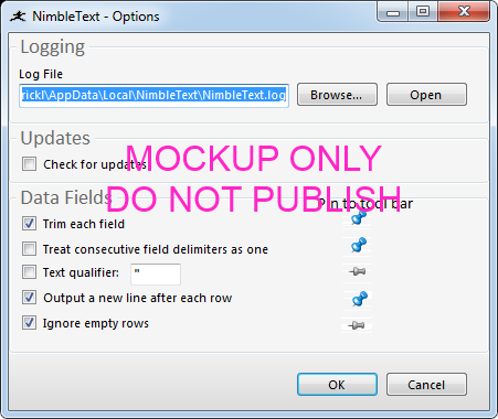
Some people asked for a "view" menu where you check or uncheck the options you want to have appear on the toolbar. Here's a quick mockup:
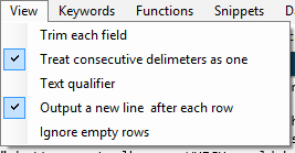
This concept was broken for two reasons.
First, it looks like you're turning the option itself on or off -- not turning on whether or not the option is shown in the toolbar.
Second, if you were to click one of those menu items, thus toggling its checked state, this would also have the undesirable side effect of closing the menu. So if you wanted to show or hide three settings you'd need to re-open the menu three times, for a total of six-clicks. Annoying behavior! (Incidentally my NextAction tool suffers this problem, embedding so many settings in deeply-nested context menus that collapse whenever you click them. Overriding this behaviour is problematic!)
So the new plan was to put checkboxes of some sort inside the Options form, adjacent to each option. But take a look at this mockup:
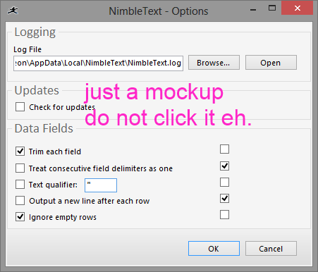
Again it's easy to think that clicking the new checkbox will cause the option to be turned on. I wasn't going to implement this or anything like it. Then I noticed the way application icon pinning works in Windows, from 7 onwards.
It's an elegant solution, maybe the nicest touch in Windows since they shot the dog.
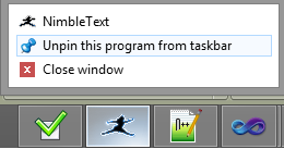
So I had my big-chief-graphic-design-intern (i.e. Me) whip out a dodgy mockup, ran it over to my main opinion-deflection-test-subject (i.e. Rhys) and after a few short bursts of shouting the project was green-lighted and implementation began.
Here's the mockup with which I got approval from the board:
If it seems weird to agonize over a small feature like this, I could point out not only a long history of such behavior from myself, but also I can provide evidence that i'm a bit of a toolbar fetishist, having written 6 articles on the topic previously:
- Rethinking Toolbars in Visual Studio (or any IDE)
- Too Many Damn Arrows in VS.Net!
- Suggested User Experience Improvements for DiffMerge
- Quick Tip: Show Shortcut Keys in Visual Studio
- KeyTraino
- Your next text editor is... MetaNote!
What UX have you agonised over lately?
Next → ← PreviousMy book "Choose Your First Product" is available now.
It gives you 4 easy steps to find and validate a humble product idea.