Your Brain, And the Effects of Syntax Highlighting
Dr. Edward de Bono wrote a little epistle once, on the value of Syntax Highlighting in your IDE.
"You are in a plane that is coming in to land at Heathrow airport in London. The plane passes over several car parks. You say to yourself: 'I am going to notice all the cars coloured red.' You look at the car park and all the cars coloured red jump out to you. Red is a fairly common colour. So you choose 'bright blue'. This colour is much more rare and your eye scans over the cars. Suddenly a bright blue car jumps out of the mass.
"There are two important points about this simple experiment. The first point is that you are giving instructions to your own brain. The second is that you are 'sensitizing' the brain to certain types of input."
Edward De Bono
Textbook of Wisdom
Syntax Highlighting is a mainstay of today's IDE's -- it helps your eyes choose to look at just one thing at a time.
If you want to look at comments, you tune out all but the green writing, for example.
To detect the keywords, you look at the blue writing and only the blue writing.
Query editors were much slower than IDE's at gaining syntax highlighting. So we developed a ritual of typing keywords in UPPER case, so that the eye can separate them more easily.
Some people might argue that syntax highlighting is just a kind of garish cosmetic to distract you from the dire ugliness of the language's syntax. Perhaps if the syntax were perfect, then no highlighting would be needed. Or: the uglier the language, the more desperately it needs cosmetic enhancement from the IDE.
One way to create such ugliness is to combine lots of language in one file. Classic ASP springs to mind.
And in classic ASP, you find some pretty brutal syntax highlighting -- no one's gonna miss those bright yellow <% signs.
Some of the ugliest syntax around is found in Text Templates used for generating code. I don't blame the tools -- it's just the polyglotic nature of code gen.
My favourite codegen tool is CodeSmith -- and, naturally, CodeSmith templates can get fairly ugly.
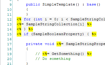
Here, syntax highlighting is of most importance, and you find the same ultra-bright template delimiters as in ye olde Visual Interdev:

What i'd like is something cleverer -- some way that let's you separate out the two languages that are intertwined. So that your mind can more easily switch gears between pondering one language and another. I don't know how. ;-)
Recently i've heard of a new spin on syntax highlighting -- in VB 9 you can embed XML statements directly in your code, so called 'XML literals'. These statements are 'lowlighted' instead of 'highlighted:'

Notice (above) how the xml is just slightly faded into the background. Subtle, but interesting.
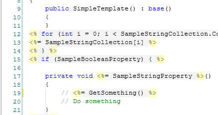
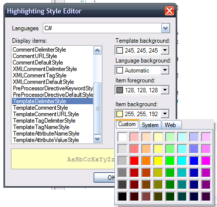
I tinkered with the settings in CodeSmith to make the template delimiters a little more subtle:

It's better, but you're limited by the color picker they use, which confines your choice somewhat.

CodeSmith's bin folder has a file called ActiproSoftware.SyntaxEditor.dll so i'm guessing they use components from ActiPro Software
(ActiPro: "The core SyntaxEditor control provides a free implementation of C# and Visual Basic that has syntax highlighting, outlining, and several other features.")
(Powershell Analyzer seems to use the same components.)
Wrapping this up -- i found an interesting (though not convincing) argument against syntax highlighting.
Next → ← PreviousMy book "Choose Your First Product" is available now.
It gives you 4 easy steps to find and validate a humble product idea.