Art of the command-line helper
The scariest code I ever wrote was the dialog in NimbleText that helps you use the command-line.
Much smack has been written in the past about confusing command-line helpers in other apps, so I set out to build this dialog with great trepidation in my heart.
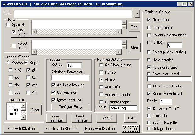
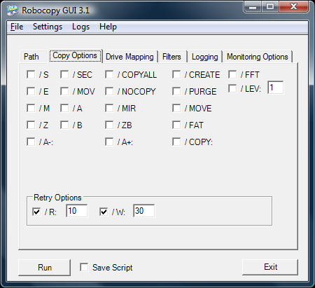
Joseph Cooney has laid into two particular apps, a gui for wget, and a gui for robocopy. Even Jeff Atwood had a stab at wGetGui.
Here's what they looked like:
And here's a typical user response upon first encountering such a command-line helper:

I downloaded both these apps and tried them out.
Okay, the kindest thing you can say is that they are comprehensive, and with their use of tooltip text they do offer a little more help than the screenshots would suggest.
But they still give an immediate slap in the face to the end user. Something I want to steer away from.
So command-line helpers are a challenge. And to increase the pressure a little more: the command-line feature in NimbleText is only unlocked if you buy a license. If I'm expecting this feature to be worth money, then I really have to not screw it up.
What I did.
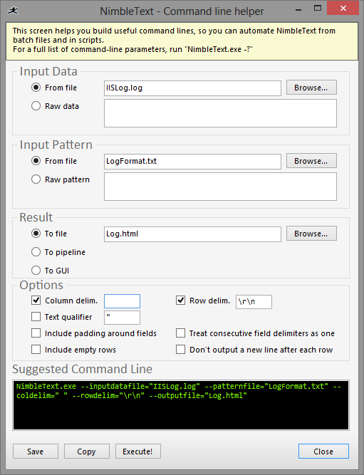
The first thing was to use descriptive labels, instead of verbatim option names. Instead of having a checkbox named "--rawdata" I'd have a label that said "Raw data". While this is only marginally more readable, it hopefully decreases the effect shown above.
Next I added a textbox at the foot of the form, where the command-line you've created is written, live, so you can see the output of your furious clicking.
There's a button for save, so you can save your command-line straight to a batch file. (It works from powershell too). A copy button, to put the command-line into your clipboard, and an execute button, which launches a cmd.exe process, and tries out the command-line immediately.
Other than that, I just sweated the small stuff. Alignment, spacing, capitalization, tab order, tool tips, everything as consistent as possible.
What I probably failed to do was give The Dialog any breathing space.
(And looking at the screenshot now I see a slight inconsistency with spacing, which should be fixed by the time you look at the application itself.)
Here's what I came up with:
Any suggested improvements? Please send them in.
Next → ← PreviousMy book "Choose Your First Product" is available now.
It gives you 4 easy steps to find and validate a humble product idea.