Navigational Spaghetti -- What are your thoughts?


![navigation in timesnapper the day after tomorrow [predicated]](https://secretgeek.net/image/timesnap_spaghetti1_th.PNG)
TimeSnapper (like a lot of software) has grown organically. From simple beginnings its feature set has expanded to contain possibilities of which we never dreamt.
But this organic growth has meant that the navigational structure within the program has failed to keep up.
Occasionally we get requests for features that are already present -- simply because existing features can be hard to locate. (I call this 'The MS Office Paradox')
Sometimes we get requests along the lines of "I once found this great feature in timesnapper, but now I can't seem to get back there." (let's call this 'The Minos Conundrum')
And sometimes we get suggestions along the lines of "How can I get from screen X to screen Y, in less than five steps, without going through any form twice?" (i call this 'The Bridges of Königsberg Puzzle)
These kind of requests have been steadily increasing over the life of the program so far, and it's not going to get any simpler.
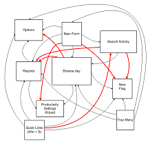
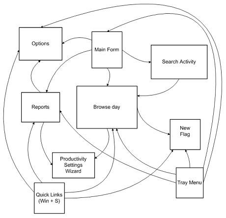
To try and understand the problem, I sat down today and drew a picture of the major forms in the application and how you can get from one to the other. The picture was too big to scan in, so I re-drew it in Visio. It ain't pretty:

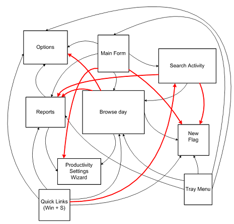
Then I added in lines for all the major new routes that people have been asking for:

And I immediately predicted where this was headed:
![navigation in timesnapper the day after tomorrow [predicated]](https://secretgeek.net/image/Flying_Spaghetti_Monster_a.JPG)
So unless we're willing to let TimeSnapper turn into a pastafarian deity, its important we address this within one or two releases.
I don't know what the best solution to this is, and we're open to ideas. If you've got any -- please share.
One thought I've had is that we could include a context menu throughout the application, so that wherever you are you can right-click and get a 'goto' menu that gives you consistent choices.
That way, without cluttering up the interface, we make every path possible. The downside to this is that it lacks discoverability. Another option is to include it as a menu at the top of each form. This would take up real-estate and sometimes seem inappropriate.
We haven't considered including a ribbon-bar, or sticking a giant MS Outlook 97-style bar on every form, or turning it into an MDI style application.
All up it's one of those simple yet thorny design issues that software development is filled with. So I thought I'd share it, and see what ideas were out there.
Next → ← PreviousMy book "Choose Your First Product" is available now.
It gives you 4 easy steps to find and validate a humble product idea.