Quick Prototyping Technique

Finally a good use for PowerPoint!
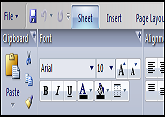
 This particular prototype was put together in PowerPoint as a fairly inexpensive way to mock up a basic Ribbon and to see whether people got the concept. Basically, we put a picture of each tab of the Ribbon in a separate slide in the PowerPoint deck. We turned off the "click to advance" functionality for each slide, and then drew a nearly transparent square around each tab of the Ribbon. Each of these squares was hooked up to an action so that clicking on them advanced to the slide that revealed the picture of the tab you were clicking on.
In this way, we were able to simulate a tabbed user interface just by drawing 8 or 10 pictures. None of the commands within the Ribbon really worked in these early prototypes; we just would watch and listen to see where they clicked within the tab.
From: The Feature Bob Invented at Jensen Harris's Office User Interface blog.
(The site beyond bullets has a few more tips on good use of powerpoint)
Next → ← PreviousMy book "Choose Your First Product" is available now.
It gives you 4 easy steps to find and validate a humble product idea.