Don't make 'readonly' fields less readable

There's a common UI anti-pattern of making "readonly" fields harder to read than editable fields.
I think this is a poor technique. I blame it on Windows Forms -- but I've seen it out there on the wild web as well.
If a control is readonly, then you should cater for the user actually wanting to read it. Shouldn't you?
Newspapers, for example are readonly. And they are commonly in black and white. Fine, crisp, perfectly legible black text. Not dull gray.
Rather than making the readonly fields dull gray, use some other form of visual hinting to differentiate between what can be edited and what can't.
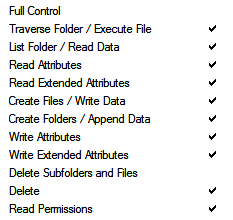
For example, here's some readonly checkboxes.
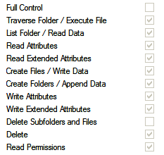
They are shown as dull gray with gray border.
Instead, the check marks could be black, while only the control border is gray.

Or, perhaps the control border could disappear.
What about this drop down list — its 'readonly' status is indicated by gray text and gray border.

It gives the impression that it has no meaning and no influence. In fact, it's message is fairly important - perhaps extra important since the user has no control over it.
It could instead have black text and gray border.

How about black text with NO border. It's easy to read, and it's clearly not editable.

I think that both of these are preferable to the 'make it gray' approach. Don't you?
And finally, as a reward to those who "clicked through", here's a repeat from last time, since no-one mentioned it ;-)

Got that? "Not a tuna!" Ha! That is genius. No, no. It is better than that. It is "genious."
Next → ← PreviousMy book "Choose Your First Product" is available now.
It gives you 4 easy steps to find and validate a humble product idea.