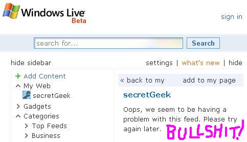
live.com... cactus.com?
 I've really tried to resist bagging this big announcement from microsoft. but i've also made the mistake of trying to use live.com
 Your online world gets better when everything works simply and effortlessly together.
Pity that the 'out of the box' experience (1) didn't work, (2) wasn't simple (3) wasn't effortless and (4) lacked 'togetherness'.
I clicked all the bits that looked clickable, watched as things changed. One box said: "You can see your Windows Live Mail or Hotmail inbox here if you sign in."
Hmmm. I was already signed in... my name was displayed in the top right, proof positive that my sign-in was successful. But no email showed up. Five minutes of digging showed me that what they meant to say was:
"You can see your Windows Live Mail or Hotmail inbox here if you sign in *AND* you've joined the beta program, for which we send you to a page from which you have to hunt around before going to another page... and even then you'd better have hotmail because we don't accept anyone else."
But of course the real test of an aggregator is: Does it successfully aggregate secretGeek.net/rss.asp??... the answer a resounding NO!

The reason i use swear words (sorry about that., by the way... I went all blythopathic for a moment) is that they imply that my feed is bad. Not true (this time). This time, I'm pretty sure the mistake is on live.com's side. And there's no hint given about what's wrong. Damn them.
Anyway, I might like live.com if:
- They let me use google as my search. (Instead i feel like they are trying to grab the web in a strangle hold)
- Their aggregator worked for secretGeek.net/rss.asp and every other page I tried
- I could plug in to my gmail account. And have it refresh on demand.
- I could plug into del.icio.us, rather than re-invent it from scratch
- It had a simple todo list functionality a-la Ta-Da
- It had something as addictive as LiveMarks or Digg Spy
Anyway... here's some other web portals around the place you might be interested in...
Kudos to the people who worked on this project though. They've definitely got some very talented people, and I hope that criticisms of live.com don't cause too much stress to the developers who've made it happen. I just find it interesting that even a multi-mega-billion dollar company can't get a launch to work seamlessly, even when the whole pitch is about working seamlessly.
Next → ← PreviousMy book "Choose Your First Product" is available now.
It gives you 4 easy steps to find and validate a humble product idea.