Dreaded Return of the Marquee Tag!

html,

On the front of this site i've put up a little ad for my brother's Oscar Tipping competition

The deal with the competition is that you nominate who you think will win each category. If you win, you get money, fame and 3.5 Jacuzzis full of sexy nude readers NOTHIN, just a mention on a website.

I'll kill off that scrolling text in a few days... I was just amused to see that IE6 still renders the marquee tag. (ymmv).


Usability in Visual Studio: Further Nitpickings of a Nitwit

Okay, here's another little suggestion i've got for Microsoft Visual Studio.

Looking at the start page in VS 2003...

microsoft visual studio  2003 start page

At startup, focus goes to the first item in the list of recently used projects, as shown here.

You might assume that clicking the 'Open Project' button would open the highlighted project ('VbNetSmartTag' in this case).

Not so.

Rather, the 'Open Project' button allows you to Browse for a project to open.

To open the selected project, you click on the name of the project.

To avoid confusion here I recommend the 'Open Project' button be renamed to 'Browse for Project' or simply 'Browse...'.

That is all. Thank you.


You know your query is getting a little intense when...

sql,

You get this dreaded message:

I love how they SHOUT it at you.

Turns out the issue was:

And yeh, I know they use capitals to indicate reserved words. I don't like it, but yeh, I get it.


The horror, the horror... that is cubicle coffee.

When a marathon coding session leads to tiredness, I always reach for a refreshing cup of Nescafe Granulated FoodService Blend.

Nescafe Granulated FoodService Blend is the market leader in consistency and value.

And what is more important in a drink than consistency and value?

It's little wonder that the people who replenish the stocks in office kitchens all over the world turn to Nescafe Granulated FoodService Blend again and again.

Ahhhhhhh. Taste that value! Mmmmmm. Above averge consistency, right down to the last drop!

mmmmmm. it is so good.

With Nescafe Granulated FoodService Blend, your code will almost write itself!


Usability Rant: Visual Studio .Net

Here's two very small usability suggestions for Visual Studio .Net

In Visual Studio .net, When you click on the dropdown list at the top of a code window you are shown the current controls/classes. (like so)

My first recommendation is that for the controls listed, a figure could be shown in brackets indicating how many of the events have been (explicitly) handled.

For example, if you've handled Button1.Click, Button1.DataBinding and Button1.Load, that's three events so there would be a number three in brackets beside Button1.

This would given you a little more information about what has or hasn't been implemented yet.

Next recommendation:

Currently, when you click on a control name, it populates the content of the next list box with the names of all events for that control, or all methods if you've selected a class.

Focus is on the first item in the list, (i.e. '(Declarations)')

I think focus should go to the first implemented event within the listbox, rather than '(Declarations)'.

If no events are yet implemented, then it should start with focus on the default event for that control, e.g. 'Click' for a button control. (The same event that would be automatically wired-in if you double-clicked on the designer's rendition of the control)

My theory behind this (untested of course... [i'm still just an ideas rat]) is that most of the time when programmers (well, myself anyway...) click on a control-name from the first drop down list, they are going to either click on an existing event handler, or if no handlers have been written, they will most likely click on the default event. Yes, anything is possible, but the majority of the time, I expect that is where they are headed.

Okay, there's the usability rant for the week.


SQL Server Enterprise Manager Tip: Printing Diagrams

This is one of those simple tips you could overlook for years, as have I.

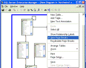
right click and choose View Page Breaks

In Enterprise Manager, when you try to print database diagrams, the insane things always end up straddling multiple pages. It's a nightmare trying to get a nice simple print out.

It's so bad I'll often reverse-engineer a diagram into Visio, just so I have proper control over the printing.

right click and choose View Page Breaks

However, there is a solution.

Right-Click and select the option 'View Page Breaks'. Now you can rearrange your tables to avoid page breaks. And a neat print out is as easy as pie.

I'm kicking myself, wishing I'd noticed this sooner.