F#: More Mandelbrot Madness

******

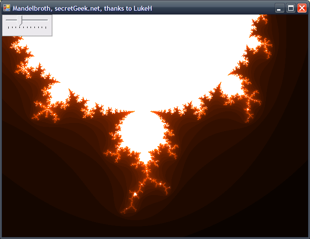
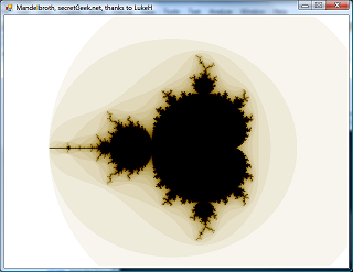
Since no-one took the bait, i had to implement my own F# bitmap writer. This was fun. Dodgy code here.

Suddenly though, Josh from TechnoFattie, wrote and said he'd tried it. His code is neater than mine, and I liked his colour scheme.

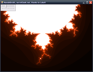
Yoink. I modified my code to use his approach in places. Then, to try and stay ahead, I implemented experimental support for zooming and panning.

"Experimental support" is a great term -- in this case it means, approximately, 'broken'.

Funny though, that this runs a great deal slower than an old fractal studio program I had on my 286.

There's a lot to be said for problem-specific optimisations.

mandelbrot
mandelbrot
 

F### yeh! i still got it baby!

lukeh put out an elegant F# mandelbrot program, that gives this output to the console:

                                        #

####
####
# ##########
#################
###################
#####################
####### ######################
######### ######################
#############################################
######### ######################
####### ######################
#####################
###################
#################
# ##########
####
####

#

i tinkered with it, just to see if i could understand how it was working...

I turned the output into this:

000000000000001111111111111111111111111111111111111111111111111111
000000000000111111111111111111111111111111111111111111111111111111
000000000011111111111111122222222222111111111111111111111111111111
000000001111111111222222222222222222222222211111111111111111111111
000000011111112222222222222222333334974433322221111111111111111111
000000111112222222222222222333333445698994333322221111111111111111
000001112222222222222222333333344457899975443333222221111111111111
000011222222222222222233333334455679 97544443322222211111111111
000112222222222222233333344567777899 99875559433222221111111111
001122222222222223333444455699 99 99999943222222111111111
001222222222223344444445557999 9654322222211111111
0122222223334469666666666799 9894332222221111111
022233333344456999999998899 975332222222111111
02333333444456799 99 964333222222111111
0333335555679999 9 754333222222111111
0 97654333222222111111
0333335555679999 9 754333222222111111
02333333444456799 99 964333222222111111
022233333344456999999998899 975332222222111111
0122222223334469666666666799 9894332222221111111
001222222222223344444445557999 9654322222211111111
001122222222222223333444455699 99 99999943222222111111111
000112222222222222233333344567777899 99875559433222221111111111
000011222222222222222233333334455679 97544443322222211111111111
000001112222222222222222333333344457899975443333222221111111111111
000000111112222222222222222333333445698994333322221111111111111111
000000011111112222222222222222333334974433322221111111111111111111
000000001111111111222222222222222222222222211111111111111111111111
000000000011111111111111122222222222111111111111111111111111111111
000000000000111111111111111111111111111111111111111111111111111111
000000000000001111111111111111111111111111111111111111111111111111
000000000000000011111111111111111111111111111111111111111111111100

I think i'm getting the hang of it!

I love learning by doing... you change a little bit and then you run it again... then you tweak something else and you see what happens...

Here's my minor variation on luke's code Only difference:

i noticed he was saying "a * a" in one place, which is very cumbersome and repetitive [ ;-) ] -- so i implemented a custom 'squared' operator in there, using this name for the operator: '!!!!!@**'

Now instead of getting sore wrists typing out something as long winded and error prone as "a * a", i could simply say ( !!!!!@** a ) and F# would treat this as a * a.

Also, i reversed the 'colours', showing how many iterations it takes the function to 'escape' the inner circle from a given point. (i did know some maths stuff once upon a time y'know).

(I wrote a 'min' function in there too. i know there'd be one implemented already, but i'm trying to do simple tinkering here ;-) )

Your mission!

Next step: do the same thing rendering pixels to a bitmap instead... then i could try breaking that up amongst multiple cores... no... sleep time.

The interested reader is invited to finish this problem for me ;-)

Also -- here it is side on!

00000000000000000000000000000000000000000000000000000000
00000000000000111222223334943332222211100000000000000000
00000000011112222222333336963333322222221111000000000000
00000111112222222223333356965333332222222221111100000000
00011111222222222223334456965443332222222222211111000000
11111112222222222233444567 76544433222222222221111111000
11111222222222222344445999 99954444322222222222211111110
1111222222222222346666799   9976666432222222222221111111
11122222222222234568999       99986543222222222222111111
1122222222222334446799         9976444332222222222211111
112222222222333444699           996444333222222222211111
1222222222333344456799         9976544433332222222221111
12222222333334455667899       99876655443333322222221111
2222222333334555799 9           9 9975554333332222222111
222223333334699999                 999996433333322222111
22223333344579                         97544333332222111
222233344456799                       997654443332222111
2223344459789                           9879544433222111
1223976789   9                         9   9876793221111
122345899    9                         9    998543221111
11233496799999                         99999769433211111
11223334445689                         98654443332211111
111223333445579                       975544333322111111
111122233344579  9        9        9  975443332221111111
1111122223334698668 9999766679999 8668964333222211111111
11111112222233344444544444444444544444333222221111111111
11111111222222222333333333333333333322222222211111111111
11111111112222222222222222222222222222222221111111111111
11111111111112222222222222222222222222221111111111111111
11111111111111111222222222222222222211111111111111111111
 

How To Re-Start A Blog

So you've finally decided to start a blog. You feel you've got a lot to say and you realise a blog might be the right place to say it. But once you've signed up... you suddenly feel a little unsure of yourself. You thought you had an infinity of ideas, but now you've got blogger's block before you've even begun... Well what do you do?

Here's what I recommend. Start by writing one short post on each of the following topics. (I'm assuming a tech audience here)

Articles To Kick Start Your Blog

  1. My favourite software/tools
  2. My favourite blogs
  3. My favourite books
  4. Technologies/Issues I wish I knew More About
  5. Technologies/Issues I wish I'd never touched.A big shout out to crystal, excel vba and MS Access 2.0 from me ;-)

Once you've published short entries on each of those, you'll have a bit of a backlog, a kind of grounding that gives you an unexpected confidence. This will also serve to help establish your own identity in a way that is more useful and less self-indulgent than most blogs.

As demonstrated by Chris Sells

As a great example, Chris Sells used this technique when starting his own blog, many decades ago, before .net 1.0 had shipped. You can read from him:

And I choose to tag...

In the nature of these kinds of suggestions, I'll tag some blogs I know of that are either new or seemed to stall early -- but all of which have creative and intelligent writers:


Nerdgasm 101

Alright, I just had a total nerdgasm.

Joe Cooney showed me his copy of 3D Programming for Windows, which is indeed signed by Charles Petzold.

Brain-fluid is shooting out my nostrils!

Q: Why has secretGeek been linking to Joseph Cooney so much lately?

A: He pays me $106 per link out. Plus, I'm working on a project with him at the moment, which is an eye-opener. He has the insight. Wish I had the insight. He knows when to put on the enterprise hat and best of all he regularly fails to see the gap between reality and internets.

For example, when taking a photograph of a real world object he says:

"I'll just take a screenshot of this."

And, when he feels he's talked too much he says:

"i'll stop spamming you now."

I like to think that our relationship is precisely akin to that of luke skywalker and the frail, aged yoda.

***

Mostly because he's a lot taller than me. In terms of wisdom the relationship ought to be reversed, but i'm more an ideas rat: not into heavy lifting.


Note that there is a web page dedicated to adding captions to this image of luke and the yodalmeister.


TimeSnapper 2.6: Hook It Up

TimeSnapper 2.6 snuck out last week, and has been going well.

There's a big list of new features available in our release notes.

We've addressed the 'navigational spaghetti' that i wrote about previously, by adding a menu available from anywhere in the application.

But the big new feature...

The BIG new feature: integrated tasks

In TimeSnapper you can 'flag' a point in time, by adding a small note against it.

These flags can actually be quite complex -- you can link them to items in your timesheet system of choice.

For example, your company might use some application for planning the projects and tasks you are working on. TimeSnapper can be configured to retrieve that list of projects and tasks, so you can record in TimeSnapper which task you were working on at a point in time.
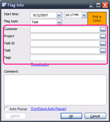
***

That feature has always been around, but only a tiny fraction of users have ever taken advantage of it.

The problem was that you needed to edit an XML file.

Now, rather than creating an XML file, there are forms for configuring the lookups.

In the options form for TimeSnapper (available by right-clicking any form and selecting 'options') there is a new tab called 'TimeSheet'.
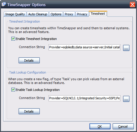
***

From here you can configure how fields in a flag are retrieved from an external system. Or you can configure how TimeSnapper's timesheets are saved to an external system.

The forms are at a stage where they're fully functional, but my god are they ugly. The first time a user sees them, I fear they'll give up in despair.

Don't get me wrong -- we've put some serious effort in. But you get to a point where you want to stop toiling in the dark, and give customers a chance to use the feature and provide guidance back to you.

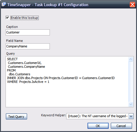
Each lookup button on the 'New Flag' dialog, basically has a 'select' query behind it:
***

We've designed it so that you can test the queries you embed, to ensure they work for your system. It was hard not to turn the system into a full blown query analyzer tool kit.

We're keen to get any feedback we can on how people use the lookup and timesheet configuration settings. Any problems, any suggestions, all are welcome.

A bunch of other features are in there as well, some of which are just the tip of new icebergs that are gradually building. I'll write about them after the next release.
 

Journey of an idea

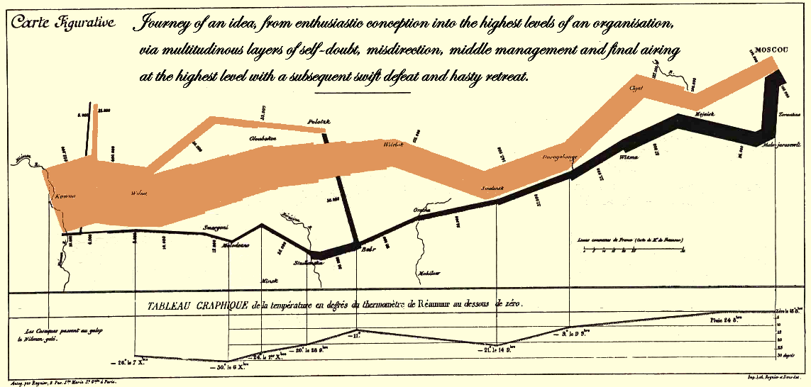
Journey of an idea, from enthusiastic conception into the highest levels of an organisation, via multitudinous layers of self-doubt, misdirection, middle management and final airing at the highest level with a subsequent swift defeat and hasty retreat.

"Journey of an idea, from enthusiastic conception into the highest levels of an organisation, via multitudinous layers of self-doubt, misdirection, middle management and final airing at the highest level with a subsequent swift defeat and hasty retreat."

An infographic after Minard. click here.

Journey of an idea, from enthusiastic conception into the highest levels of an organisation, via multitudinous layers of self-doubt, misdirection, middle management and final airing at the highest level with a subsequent swift defeat and hasty retreat.
  1. Tufte likes Minard's original chart
  2. I like Tufte
  3. and i'm certain that (were he alive and well today) Minard would be a subscriber to secretGeek.

So it is indeed a virtuous circle.

I don't have the time (or graphical skills) to embed the kind of high res notations I'd like to include, showing the various checkpoints along the way as an idea moves from conception to defeat. And I don't have the time to alter the axis at the foot of the image to show "organisational altitude" versus "buy-in."

But maybe a procrastinating graphic designer out there (and they are all procrastinating are they not?) can read my mind on this topic and knock up a high res version for me. And then cooney man can put the t-shirts on cafe press, and the daily quaker can provide the whiteboard version. M'kay?

Larger size [2292*1096]

Happy side note: frequent commenter, 'Farmer JEB', (aka, my brother) is currently in new york, en route to see Tufte in person, after winning a Tufte inspired competition at his workplace. Go JEB! Give Tufte hell!


Bug Eyed VS2008 Guy Freaks Me Out

My minders and the other people who care for me have told me not to put this blog entry out.

They have told me that it is cruel and bilious. That it is just trash talk and hater-speak.

But I won't be silenced. I cannot be oppressed. The right to free speech is up there. Pretty high. At least 7 out of 10. So I shall share.

Here I go.

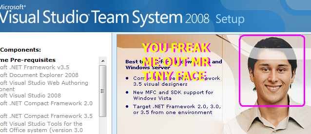
Where did they find this freak whose shows up in the VS2008 install? Who is he? What the hell happened to him?

vs2008 install

I must have kicked off at least 10 VS2008 installs in the last few months -- and i keep getting more and more freaked out by this guy.

HIS FACE IS TOO SMALL FOR HIS HEAD! His eyes are beady. And they seem to follow your mouse cursor around the screen. Don't they!?

I really think he's an example of photoshop touch ups gone wrong.

If you draw a line from the centre of his chin to the tip of his crown, you'll see that his face is slightly off centre with his head.

While this could be a genuine congenital abnormality, I think it's the result of poor digital cosmetic surgery.

In their haste to air brush any blemishes out of this guy, they -- the marketing/design people at microsoft -- have removed his face and later pasted it back on, slightly out of place and a little bit too small.

To demonstrate this, I've drawn the apparent centre line of his head in green, and what I consider the true centre line in blue.

centre line of head does not match centre line of face

The biggest problem is that his face is simply smaller than it should be. So I've corrected the problem.

Here was my first attempt:

face centred on head

You'll agree he looks perfectly normal now.

And after a little lip and eye surgery I think he looks even better again. He could go onto bigger things, perhaps appearing in the install for Expression Blend, which I'm told has a much higher quality bar.

nicer eyes and mouth

Also...


Fuzzy Search: Check this out and report back please, o lazy web.

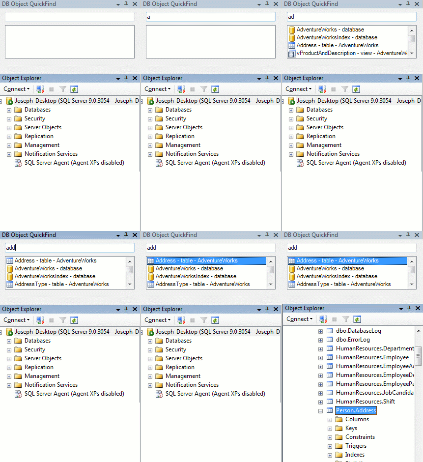
type in the sproc or table name... hey presto it appears as you type! Even forgives bad spelling!

Ah-ha! A fine example of incremental search can be seen in JCooney's excellent add-in for SQL Server Management Studio 2005.

You begin to type the name of the object you're after -- and hey presto, using some mega-tricky fuzzy logic it finds every vaguely related to what you've typed.

Very useful if you find yourself performing Exploratory SQL Development -- or even if you just suffer NADD and can't remember the exact name of the sprocs you just wrote.

The fuzzy search feature is provided by Australian Micro-ISV Shuffle Text. At their blog you will find an incredible, epic and very honest post about building a micro isv.

The landing page for shuffletext highlight (their fuzzy search tool) claims:

only 3-4 lines of code required to get Highlight integrated in to your .NET app!

Bold claims! Brassy stuff!

How about this, o lazy web...

you check it out, download it for me, try it out, and get back to me: is it that easy to use?

Does the fuzzy search actually work? or is it just some crackpot hairbrain fool's gold banter from a bunch of ninkompoop hasbeen wannabe's? The sort of stuff JCooney usually includes in his 'works on my machine' code? Or is it as clever and easy to use as it appears?

Nifty tool... if we can find a way to include it in TimeSnapper then I'm sure we will!


Idea: Ribbon Bar Item Finder

type in the property you want and the relevant tab will light up with the control highlighted

As a special reward to the people with longer attention spans, I've included a joke near the end of this blog entry. I highly recommend continuing up to that point, at least, as it is certainly one of the funnier jokes that has been written since, let us say, the invention of trans-human discourse.

But first, here's a free idea which I would like to share with our old buddies, the Office Team: why not add a 'finder' at the top of your nifty ribbon bars?

Just say you're using Winword.exe from Office 2007 and you're hunting through the ribbon bar looking for something. In this case you're wondering...

"Hmmm. how do i create a two-column layout?"

Here's my suggestion:

A small textbox at the top right could act as a navigation aid, and would also search the document.

In the example, as we type "column" into the 'finder' any tabs that contain 'Column' related properties would light up in some ambient way, with an indication of how relevant they are. (In the screenshot I've got the number "2" appearing, as if to say 'There are two Column-related items in this tab right here!')

This behaviour would happen 'as you type', much like incremental find in firefox and visual studio.

I for one could use this feature all the time.

type in the property you want and the relevant tab will light up with the control highlighted

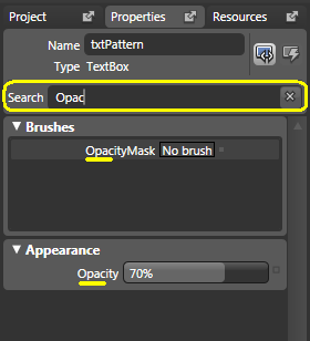
The idea is inspired by vista's start menu search box, and by the property search experience in expression blend:

property search in expression blend

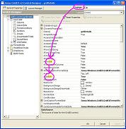
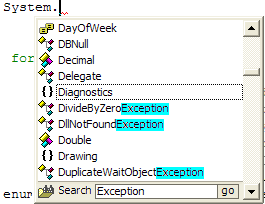
(I wanted something similar in Janus property inspectors and intellisense a few years ago)

Intellisearch highlight the words you're looking for

And now for my very funny joke. You've been good. Prepare for an excellent reward.

Q: Why did the retired mathematician sell his blackboard?

A: Because he had nothing left to prove.

2.5 dimensional view of document layout

Also here's a recent article by Paul Stovell where he suggests some changes to the designer concept for WPF. My favourite thought here is the 2.5 dimensional view of the layout. Clever stuff.


Beautiful Code, or rather, Beaut Comments.

My code isn't worth boasting about, but I think I've written some nice comments in my time.

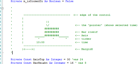
Here's a comment from TimeSnapper that I'm particularly proud of.

comment representing timebar control

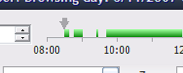
It uses an ascii diagram to describe how a bunch of constants relate to the shape of the TimeBar control:

timebar control itself

One day, hopefully my best work will be in the code, not just the comments ;-)

(The obvious side thought is -- why can't we embed diagrams and images in the comments of our code? Or at least some kind of textile-style wiki-like markup/markdown? And how much does that thought make you shudder as a potential avenue of IDE abuse?)